Moving from R to python - 3/7 - matplotlib and seaborn

- 1 of 7: IDE
- 2 of 7: pandas
- 3 of 7: matplotlib and seaborn
- 4 of 7: plotly
- 5 of 7: scikitlearn
- 6 of 7: advanced scikitlearn
- 7 of 7: automated machine learning
Table of Contents
Visualisations in python
In R I am used to work with a combination of ggplot2 and plotly. It seems that in python you have matplotlib which is fully integrated into pandas and you have seaborn which provides some pretty default setting for most of matplotlib’s standard graph types.
The main difference of matplotlib to ggplot2 is that it is optimised for wide formatted data tables while ggplot2 is optimised for data in the long format. In matplotlib we we woul iterate over every column that we would want to add to our plot while in ggplot we would define x and y measurements and then select a grouping or facetting variable.
seaborn
seaborn is built on top of matplotlib it provides some pretty decent defaults for matplotlib and has a stunning example gallery. seaborn supports long and wide format as input.
import pandas as pd
from matplotlib import pyplot as plt
%matplotlib inline
import seaborn as sns

df = sns.load_dataset('iris')
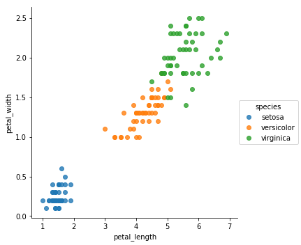
Scatter Plots
sns.lmplot()
This is in fact a scatter plot function, we just have to turn of the regression fit.
sns.lmplot(x = 'petal_length', y = 'petal_width', data = df
           , hue = 'species'
           , fit_reg = False)
<seaborn.axisgrid.FacetGrid at 0x1fbd57e16a0>
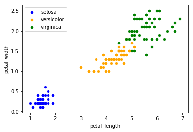
Compare to matplotlib method plt.scatter()
is a lot more complicated, we have to add each species manually to an axes supplot object. This is very inconvenient.
# old school
ax = df.loc[ df['species'] == 'setosa', : ].plot.scatter('petal_length', 'petal_width', label = 'setosa', color = 'blue')

# functional indexing
ax = df.query('species == "versicolor"') \
    .plot.scatter( 'petal_length', 'petal_width'
                  , label = 'versicolor'
                  , color = 'orange'
                  , ax = ax )

ax = df.query('species == "virginica"') \
    .plot.scatter( 'petal_length', 'petal_width'
                  , label = 'virginica'
                  , color = 'green'
                  , ax = ax )
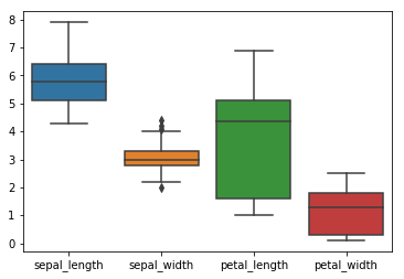
Boxplots
From wide format
here we cannot use hue to assign groups to colors
sns.boxplot(data=df)
<matplotlib.axes._subplots.AxesSubplot at 0x1fbd0345b00>
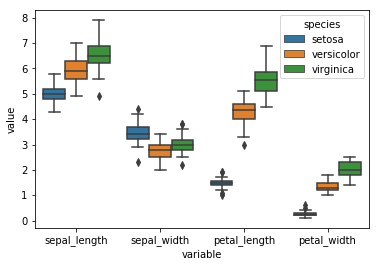
From short format
df_melt = df.melt(value_vars=['sepal_length', 'sepal_width', 'petal_length', 'petal_width']
                 , id_vars = 'species')


sns.boxplot('variable', 'value', data = df_melt, hue = 'species')
<matplotlib.axes._subplots.AxesSubplot at 0x1fbd4e51b00>
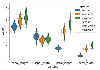
Overlay Plots
We can easily overlay plots as follows. The problem is that nevertheless the plot order is a bot messed up and there is no option to change the color of the box outline to black. Probably in order to fix this we would need to iterate over the box outlines and set their color attribute to ‘black’ which is a bit of a pain in the ass.
sns.violinplot('variable', 'value', data = df_melt
               , hue = 'species'
               , inner = None ## removes inner boxes
               , zorder = 1
              )

sns.boxplot('variable', 'value', data = df_melt
            , hue = 'species'
            , palette = ['#FFFFFF','#FFFFFF','#FFFFFF']
            , saturation = 1
            , zorder = -1 ## send boxplot to background
           )
<matplotlib.axes._subplots.AxesSubplot at 0x1fbd4fcb588>
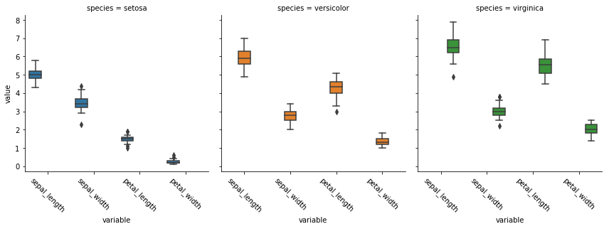
Factor Plots (facetting)
ax = sns.factorplot('variable', 'value', data = df_melt
              , hue = 'species'
              , col = 'species'
              , kind = 'box' )

ax.set_xticklabels(rotation = -45)
<seaborn.axisgrid.FacetGrid at 0x1fbce3f4eb8>
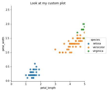
Customize Plots with matplotlib
All seaborn plots can be tweaked and edited using matplolib, for example we can add a title and limit the range of the x-axis.
sns.lmplot(x = 'petal_length', y = 'petal_width', data = df
           , hue = 'species'
           , fit_reg = False)

plt.xlim(0,5)
plt.title('Look at my custom plot')
Text(0.5,1,'Look at my custom plot')
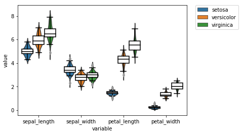
We can also fix the overlay plot from before
# instantiate axis and figure
fig, ax = plt.subplots()

ax = sns.violinplot('variable', 'value', data = df_melt
               , hue = 'species'
               , inner = None ## removes inner boxes
               , ax = ax
               , legend_out = True
              )

ax = sns.boxplot('variable', 'value', data = df_melt
            , hue = 'species'
            , palette = ['#FFFFFF','#FFFFFF','#FFFFFF']
            , saturation = 1
            , ax = ax
           )

# the boxes are drawn onto the axis as artist objects
for artist in ax.artists:
    artist.set_edgecolor('black')
    artist.set_zorder(1)

# the caps and whiskers as line objects
for line in ax.lines:
    line.set_color('black')

# get legend handles and labels before drawing legend
# use only 3 of them for legend
handles, labels = ax.get_legend_handles_labels()
plt.legend(handles[0:3], labels[0:3]
          , bbox_to_anchor=(1.05, 1), loc=2, borderaxespad=0.)
<matplotlib.legend.Legend at 0x1fbd5510ba8>
Multiple Plots
Having multiple plot as output from one code chunk in markdown is a bit tricky, in jupyter notebooks it is not.
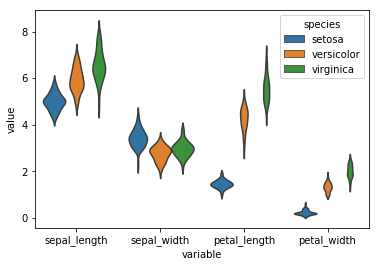
sns.violinplot('variable', 'value', data = df_melt
, hue = 'species'
, inner = None ## removes inner boxes
)
plt.show()
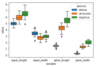
sns.boxplot('variable', 'value', data = df_melt
, hue = 'species'
, saturation = 1
)
plt.show()
Summary
Personally I find pure matplotlib very cumbersome. However seaborn provides some nice defaults and supports the long data format. However if you want to plot something a bit more complicated then their showcase examples you get stuck tweaking the plots in matplotlib. There is a python version of the ggplot which I hear is quite popular and a newr package called altair which is also meant to work on long format. However there does not seem anything in the python world that beats pure ggplot2. I will rather keep using the original, in a later post I will show you how you can mix up R and python code in a single jupyter notebook and how to pass variables between the two environments.