Polyglot conda environments - 3/3 - jupyter and rpy2
Table of Contents
Here we want to show how we can use R and python in the same jupyter notebook.
jupyter notebooks
We first need to create a conda and install R and python and jupyter, then we need to activate that environment and run the jupyter notebook command. When creating a new notebook you will automatically use the active conda environment as a kernel.
For the sake of completeness you can also install the IRkernel and follow the instructions in order to start up a jupyter notebook using a R kernel.
When installing the package nb_conda you will be able to select a conda kernel from all the conda kernels on your system via the jupyter notebook GUI. For mixed environments you can select whether it should be a R or a python notebook. When you want to mix both languages inside one notebook rpy2 will always look for the R installation circumventing jupyter. It is therefore important that you activate the appropriate mixed environment before starting jupyter.
mixing R and python with rpy2
rpy2 allows us to mix R and python code in our jupyter notebook by using the rmagic commands, which are part of the rpy2 package.
First we import the ipython module from rpy2
%load_ext rpy2.ipython
The rpy2.ipython extension is already loaded. To reload it, use:
  %reload_ext rpy2.ipython
We can execute a line of R code using the %R prefix. The last returned variable is treated as cell output
%R X=c(1,4,5,7); sd(X); mean(X)
array([4.25])
I would recommend using conda which allows us to manage python and R packages in the same environment. The following code will check the R version jupyter is using.
%R d = as.data.frame( R.Version() )
%R d = d['version.string']
| version.string | |
|---|---|
| 1 | R version 3.4.3 (2017-11-30) |
We can get variables from the R instance that jupyter is running in the background using the %Rget command as cell output.
%Rget d
| version.string | |
|---|---|
| 1 | R version 3.4.3 (2017-11-30) |
We can pass variables from the python environment into the R environment using %R -i
import pandas as pd
df = pd.DataFrame( dict(a = [1,2,3], b = [4,5,6]) )

%R -i df
%R df_R = df
%Rget df_R
| a | b | |
|---|---|---|
| 0 | 1 | 4 |
| 1 | 2 | 5 |
| 2 | 3 | 6 |
Similarily we can pass variables from R back to python using %R -o
%R -o df_R
df_R
print( 'type of imported R object: ' + str( type(df_R) ) )
df_R
type of imported R object: <class 'pandas.core.frame.DataFrame'>
| a | b | |
|---|---|---|
| 0 | 1 | 4 |
| 1 | 2 | 5 |
| 2 | 3 | 6 |
We can also define an entire cell as R code using %%R and run complex R code that uses external none-standard R packages. (Note for this code bit to run you need to create a conda environment from one of the .yml files found here).
%%R -o df
require(tidyverse)
require(oetteR)
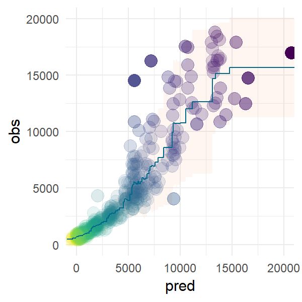
m = lm(price ~ carat + depth, ggplot2::diamonds)
df = tibble( obs = ggplot2::diamonds$price
, pred = predict(m, newdata = ggplot2::diamonds) ) %>%
f_prediction_intervall_raw( 'pred','obs', intervall = 0.975) %>%
f_prediction_intervall_raw( 'pred','obs', intervall = 0.025)
p = f_plot_pretty_points( dplyr::sample_n(df, 500), 'pred', 'obs' ) +
geom_ribbon(mapping = aes(ymin = pred_PI2.5_raw
, ymax = pred_PI97.5_raw
, fill = 'lightsalmon')
, data = df
, color = NA
, fill = 'lightsalmon'
, alpha = 0.1 ) +
geom_line(mapping = aes(x = pred
, y = pred_mean_raw
)
, data = df
, color = 'deepskyblue4'
#, size = 1
) +
coord_cartesian( xlim=c(0,20000), ylim = c(0,20000))
# reorganize layers
p$layers = list(p$layers[[2]], p$layers[[1]], p$layers[[3]] )
print(df)
# A tibble: 53,940 x 6

     obs  pred steps               pred_PI97.5_raw pred_mean_raw pred_PI2.5_raw

   <int> <dbl> <fctr>                        <dbl>         <dbl>          <dbl>

 1   337  -897 [ -897.30, -368.04)             645           492            338

 2   367  -879 [ -897.30, -368.04)             645           492            338

 3   367  -797 [ -897.30, -368.04)             645           492            338

 4   478  -789 [ -897.30, -368.04)             645           492            338

 5   386  -781 [ -897.30, -368.04)             645           492            338

 6   367  -767 [ -897.30, -368.04)             645           492            338

 7   425  -758 [ -897.30, -368.04)             645           492            338

 8   472  -758 [ -897.30, -368.04)             645           492            338

 9   367  -756 [ -897.30, -368.04)             645           492            338

10   472  -748 [ -897.30, -368.04)             645           492            338

# ... with 53,930 more rows
Plots
We can plot R graphics as follows using %%R -w 5 -h 5 --units in -r 200 which sets the output to 5 x 5 inches with a resoulution of 200 dpi. Note this only works as cell magic not as in-line magic.We are using the ggplot2 plot which we created in the previouse R cell.
%%R -w 3 -h 3 --units in -r 200
p
htmlwidgets
plotly
We can convert ggplot2 plots to plotly objects and save them as html and embedd them in an iframe.
%%R
require(plotly)
pl = ggplotly(p, tooltip = c('~pred_mean_raw', '~pred_PI2.5_raw', '~pred_PI97.5_raw'))
htmlwidgets::saveWidget(pl, 'pred_intervall.html' )
from IPython.display import IFrame

IFrame("./pred_intervall.html"
      , width = 700
      , height = 700)
DT
Similarly to plotly we can embedd dynamic datatables from the DT package
%%R

dt = oetteR::f_datatable_universal( sample_n(df, 500) )
htmlwidgets::saveWidget(dt, 'table.html' )
IFrame("./table.html"
      , width = 1100
      , height = 600)
tabplot
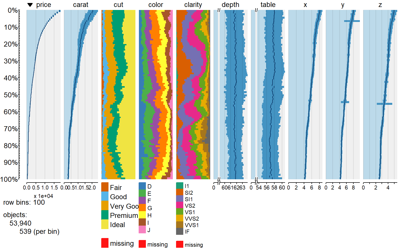
We can use other packages from R to integrate other useful visualisations such as tabplots
%%R -h 5 -w 8 --units in -r 200

require(tabplot)

tableplot( select(ggplot2::diamonds, price, carat, everything()) )
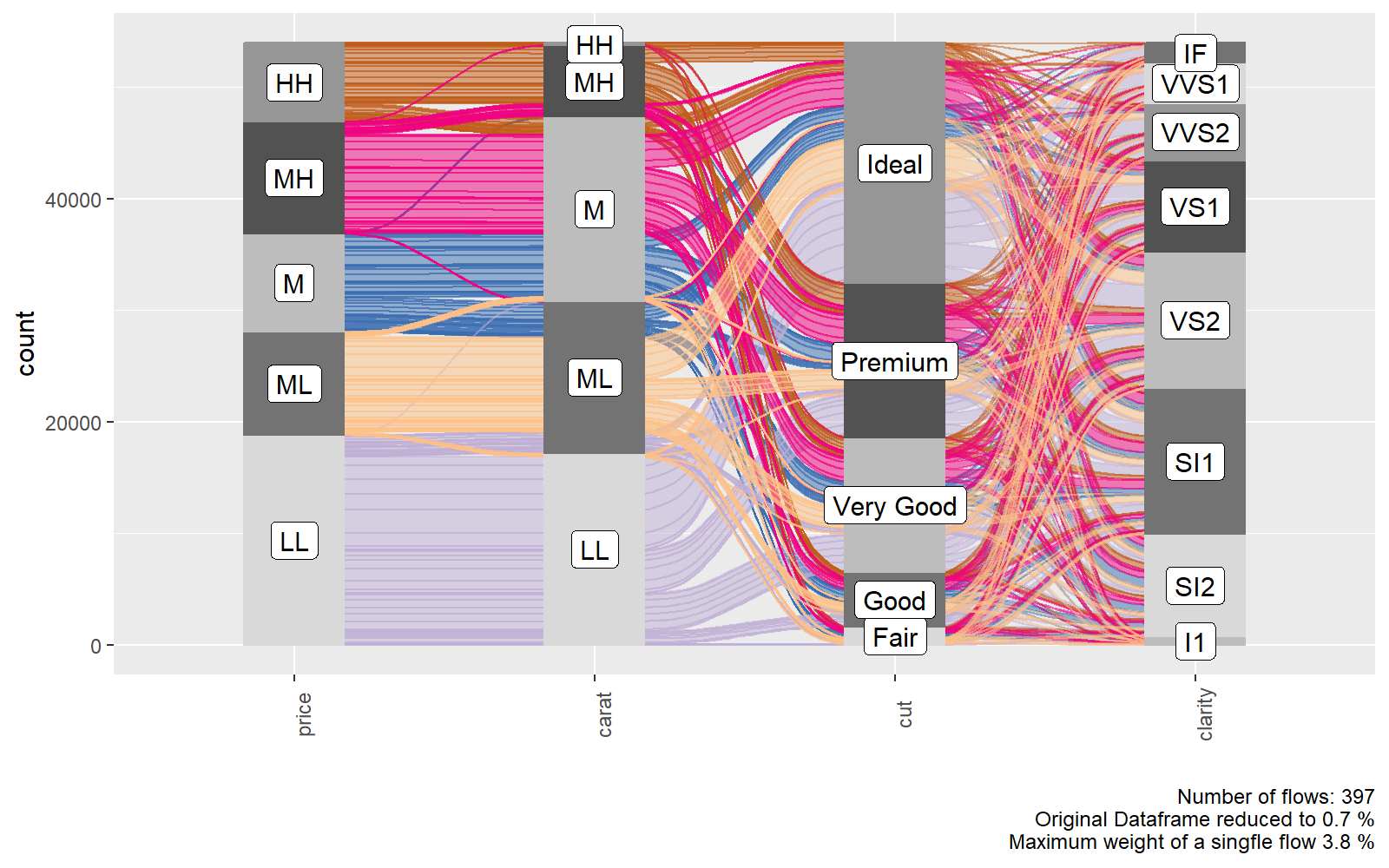
ggalluvial
%%R -h 5 -w 8 --units in -r 200

require(oetteR)

f_plot_alluvial( select(ggplot2::diamonds, price, carat, cut, clarity) )
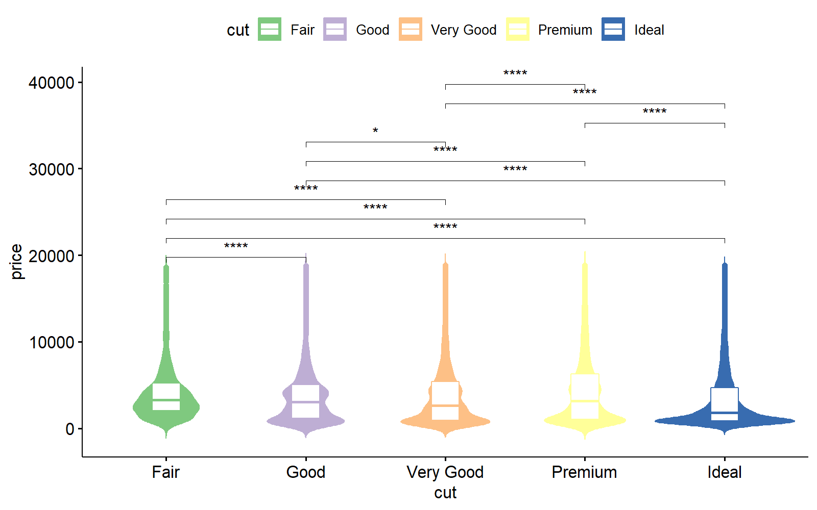
ggpubr
%%R -h 5 -w 8 --units in -r 200

require(ggpubr)
require(oetteR)

# generates all possible compbinations and removes pairings with P val > thresh
compare = f_plot_generate_comparison_pairs(ggplot2::diamonds, 'price', 'cut', thresh = 0.05)

ggviolin( data = ggplot2::diamonds
           , x = 'cut'
           , y = 'price'
           , color = 'cut'
           , fill = 'cut'
           , palette = f_plot_col_vector74()
           , add = 'boxplot'
           , add.params = list( fill = 'white')
           ) +
  stat_compare_means(comparisons = compare, label = "p.signif")