Joyplot Logo
Welcome to my data science blog datistics where I will gradually post all the vignettes and programming POC’s that I have written over the past two years. Most of them can be already found in my github repository.
I am using blogdown to create this blog and using R and RStudio. However I have recently taken up python programming for work again, so my first challenge will be to also add posts in the form of jupyter notebooks.
As for my first post I will add the code that I use to generate my page logo in R.
Tweedie distributions
We often encounter distributions that are not normal, I often encounter poisson and gamma distributions as well as distributions with an inflated zero value all of which belong to the family of tweedie distributions. When changing the parameter \(p\) which can take values between 0 and 2 ( p == 0 gaussian, p == 1 poisson, p == 2 gamma) we can sample the different tweedie distributions.
the tweedie package only supports values for 1 <= p <= 2
suppressWarnings({
  suppressPackageStartupMessages({
    require(tidyverse)
    require(tweedie)
    require(ggridges)
  })
})
df = tibble( p = seq(1,2,0.1) ) %>%
mutate( data = map(p, function(p) rtweedie(n = 500
, mu = 1
, phi = 1
, power = p ) ) ) %>%
unnest(data)
df %>%
ggplot( aes(x = data) )+
geom_histogram(bins = 100, fill = '#77773c') +
facet_wrap(~p, scales = 'free_y')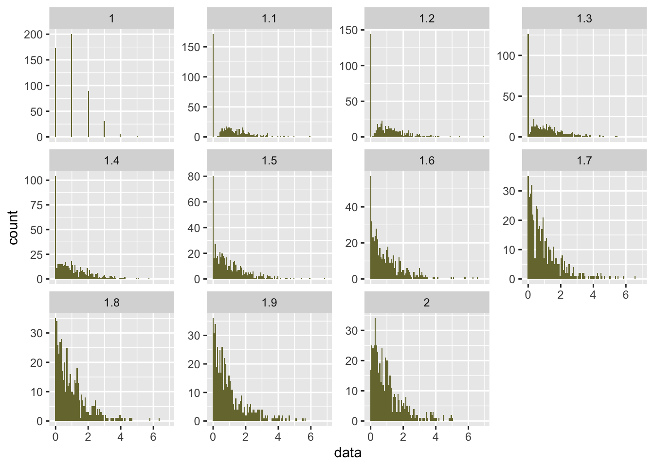
Joyplot
We will now transform these distributions into a joyplot in the style of the Joy Divisions album Unknown Pleasurs cover art.
We will use ggridges formerly known as ggjoy.
joyplot = function(df){

  p = df %>%
    ggplot(aes(x = data, y = as.factor(p), fill = ..x.. ) ) +
      geom_density_ridges_gradient( color = 'white'
                                   , size = 0.5
                                   , scale = 3) +
      theme( panel.background = element_rect(fill = 'white')
             , panel.grid = element_blank()
             , aspect.ratio = 1
             , axis.title = element_blank()
             , axis.text = element_blank()
             , axis.ticks = element_blank()
             , legend.position = 'none') +
     xlim(-1,5) +
     scale_fill_viridis_c(option = "inferno")

  return(p)

}

joyplot(df)
## Picking joint bandwidth of 0.236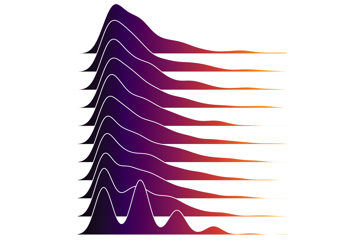
I order to distribute them a bit better over the x-axis we will transform them using a sine wave pattern.
df = tibble( p = seq(1,2,0.05)
             , rwn = row_number(p)
             , sin = sin(rwn) ) %>%
  mutate( data = map(p, function(p) rtweedie(500
                                             , mu = 1
                                             , phi = 1
                                             , power = p)  ) ) %>%
  unnest(data) %>%
  filter( data <= 4) %>%
  mutate( data = ( 4 * abs( sin(rwn) ) ) - data )


joyplot(df)
## Picking joint bandwidth of 0.205